Brand identity2026
Cartela
A brand for digital menus: a gingham tablecloth where one square changes colour.
Cartela is my studio for digital menus for restaurants, bars and cafés: you cook, we keep the menu up to date. I named it, designed its identity and built the site at cartela.live.
01
The idea
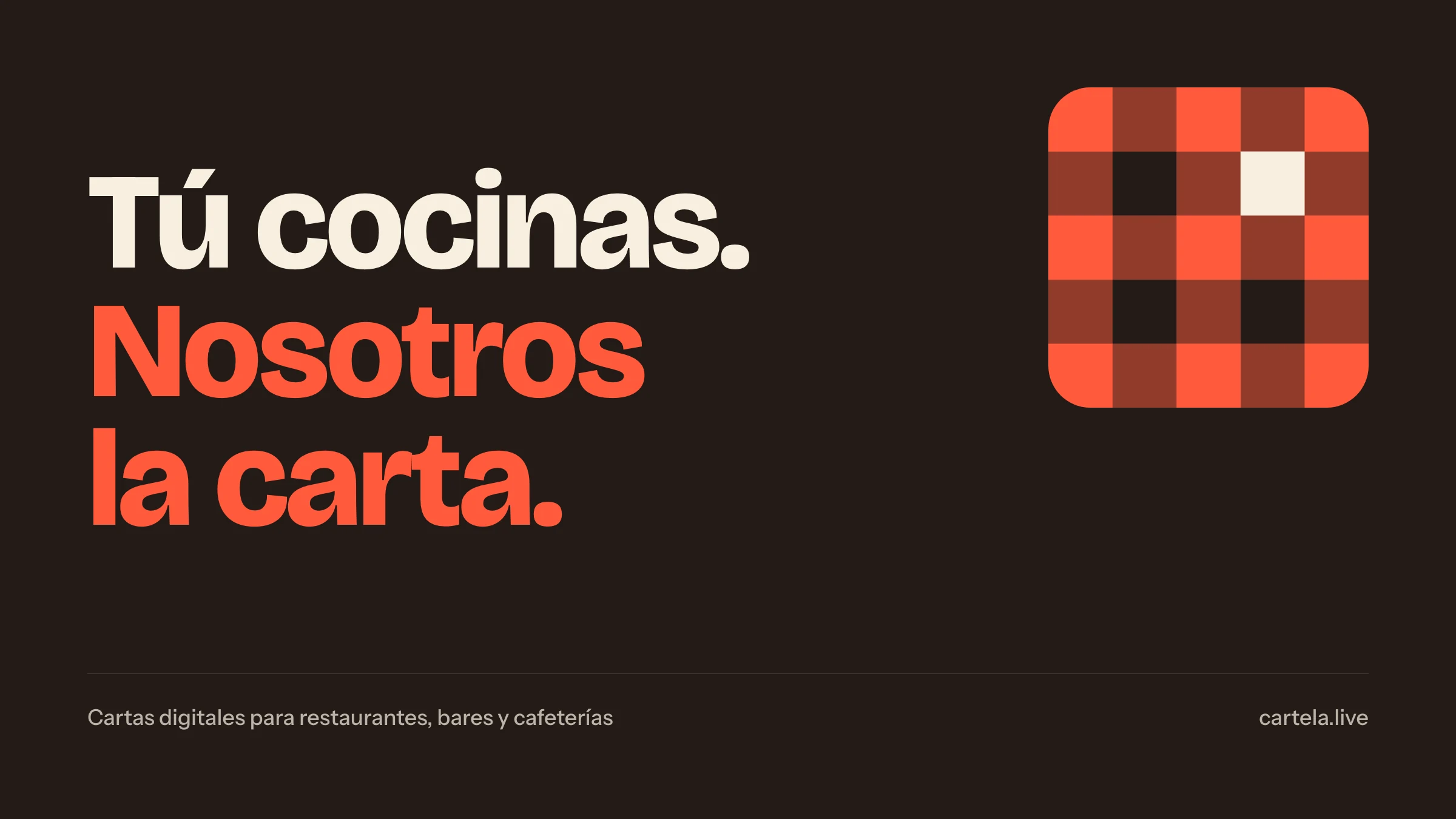
A restaurant menu changes all the time: the octopus runs out, a beer goes up 30 cents. Cartela keeps the digital menu up to date so the place never has to touch it. The symbol says it: a piece of the classic tablecloth where one square changes colour. That square is your menu, changing.
02
Logo
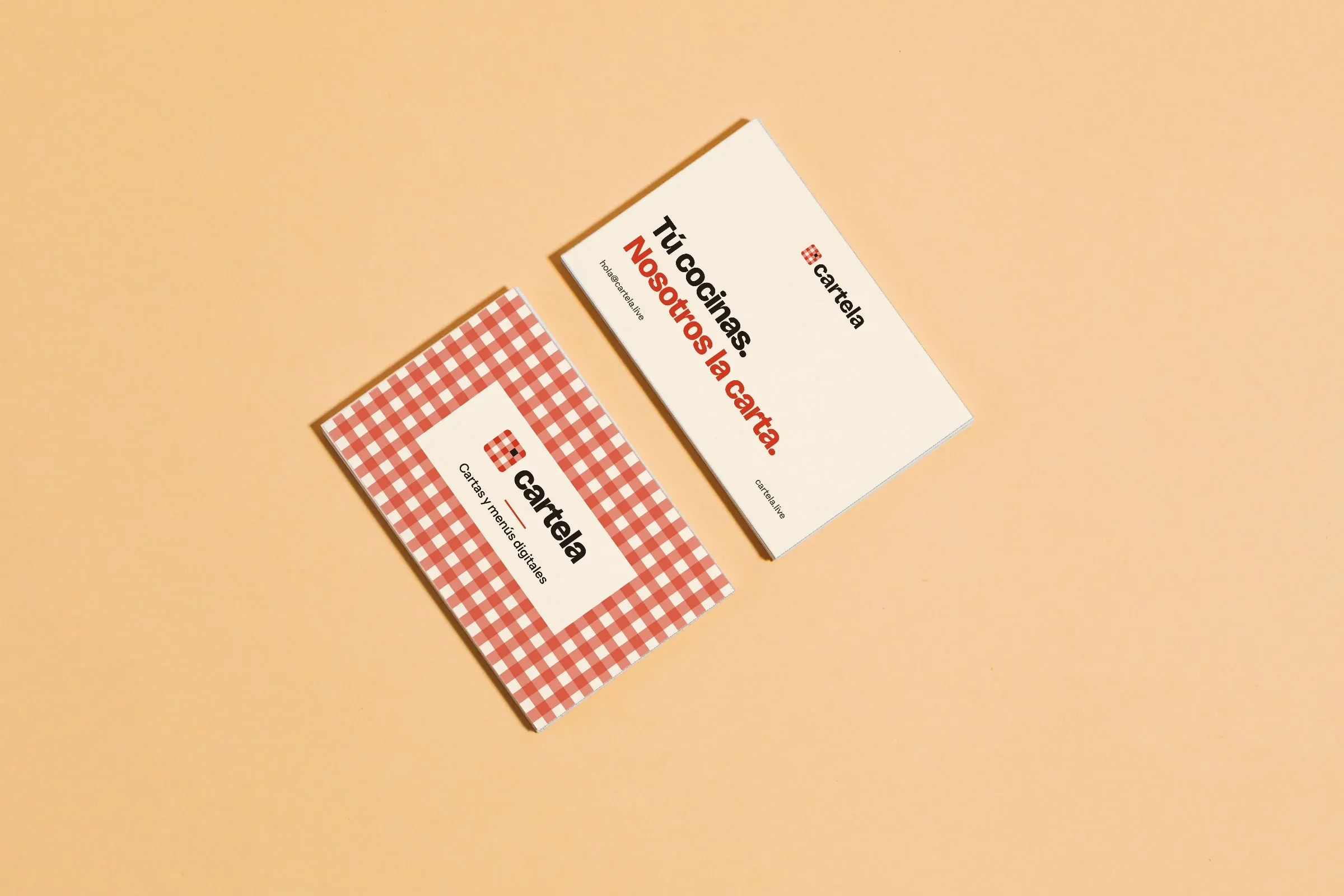
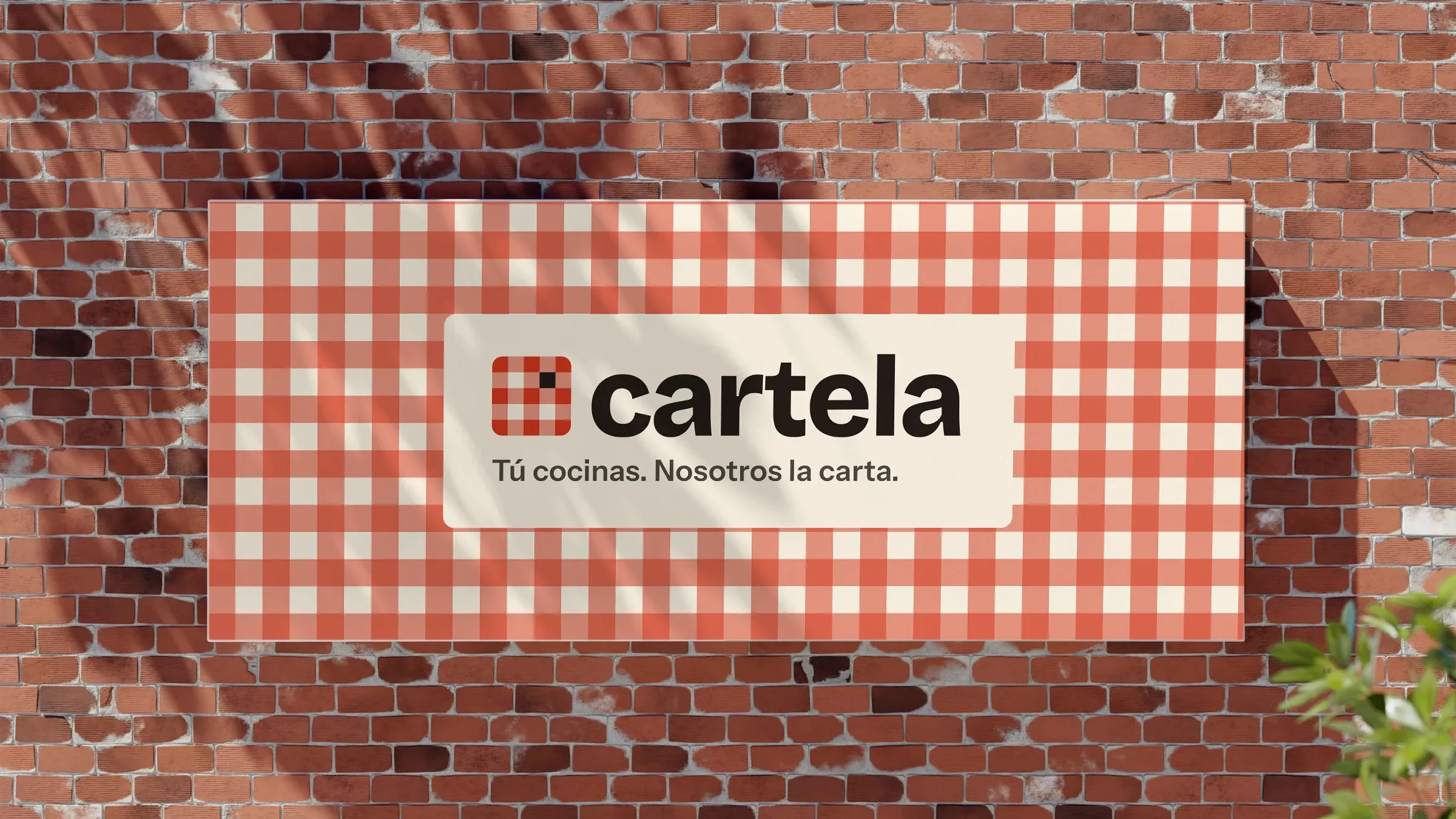
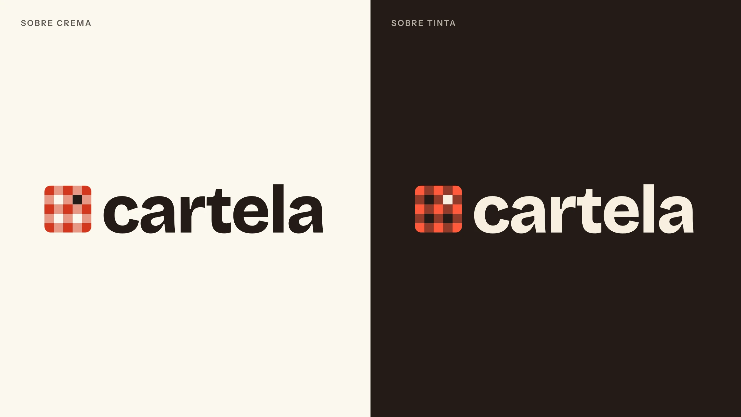
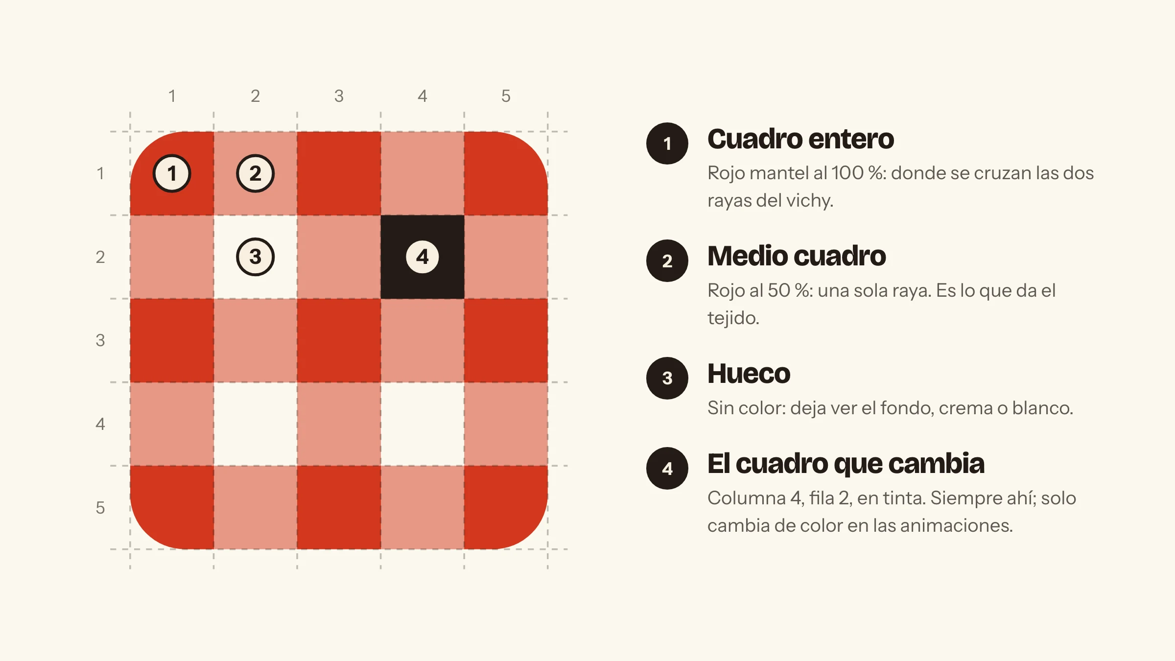
A 5 × 5 piece of gingham with rounded corners: full squares, half squares and gaps make the weave from a single red, and one square in ink is the one that changes. It always sits in the same place, column four, row two. The wordmark is Bricolage Grotesque ExtraBold, drawn as outlines, with the weight of a bar sign.
03
Colour
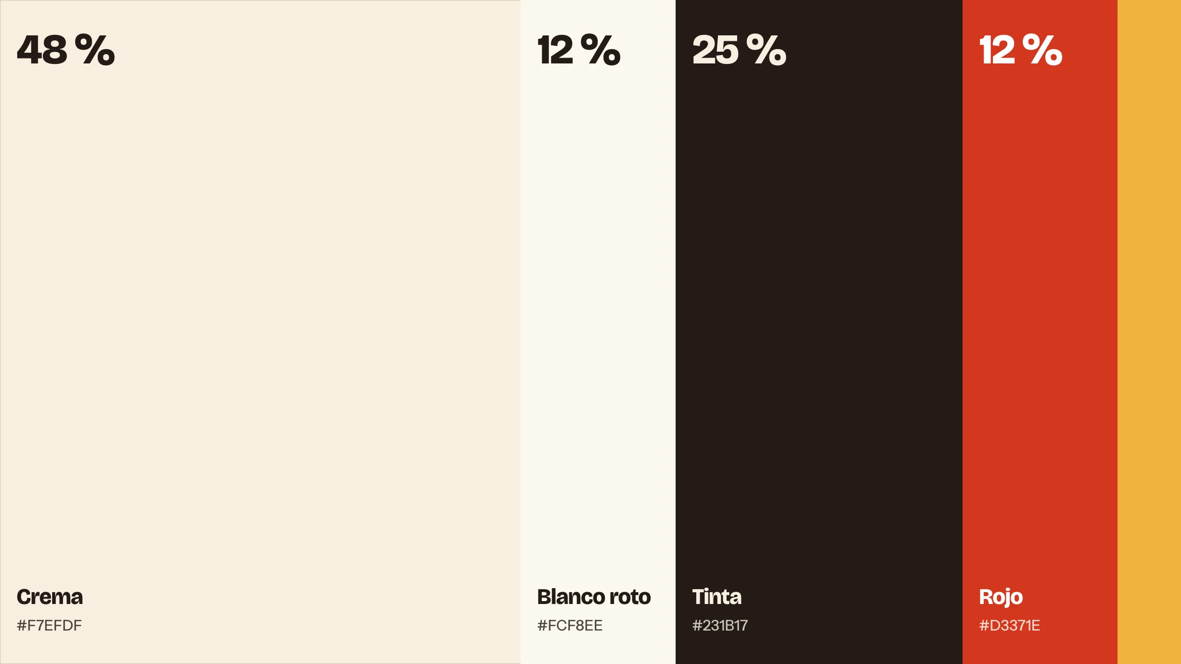
A short, table-top palette: cream for everything, ink for reading, tablecloth red just enough to be noticed and a touch of mustard. The proportion matters as much as the colours.
04
Typography
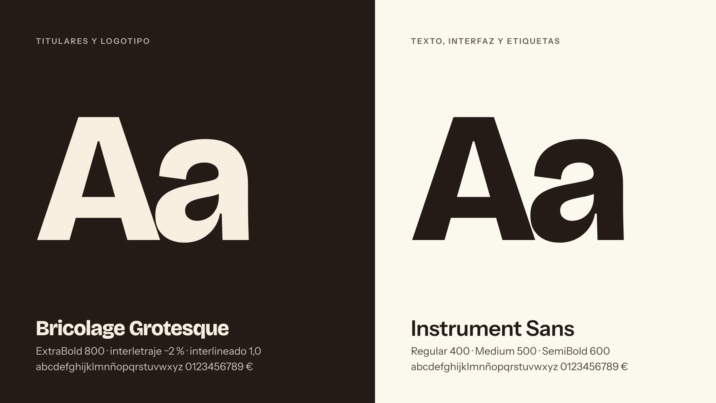
One that shouts and one that explains. Bricolage Grotesque ExtraBold for the logo and headlines; Instrument Sans for everything else, clear and comfortable on a phone.
05
Graphic language
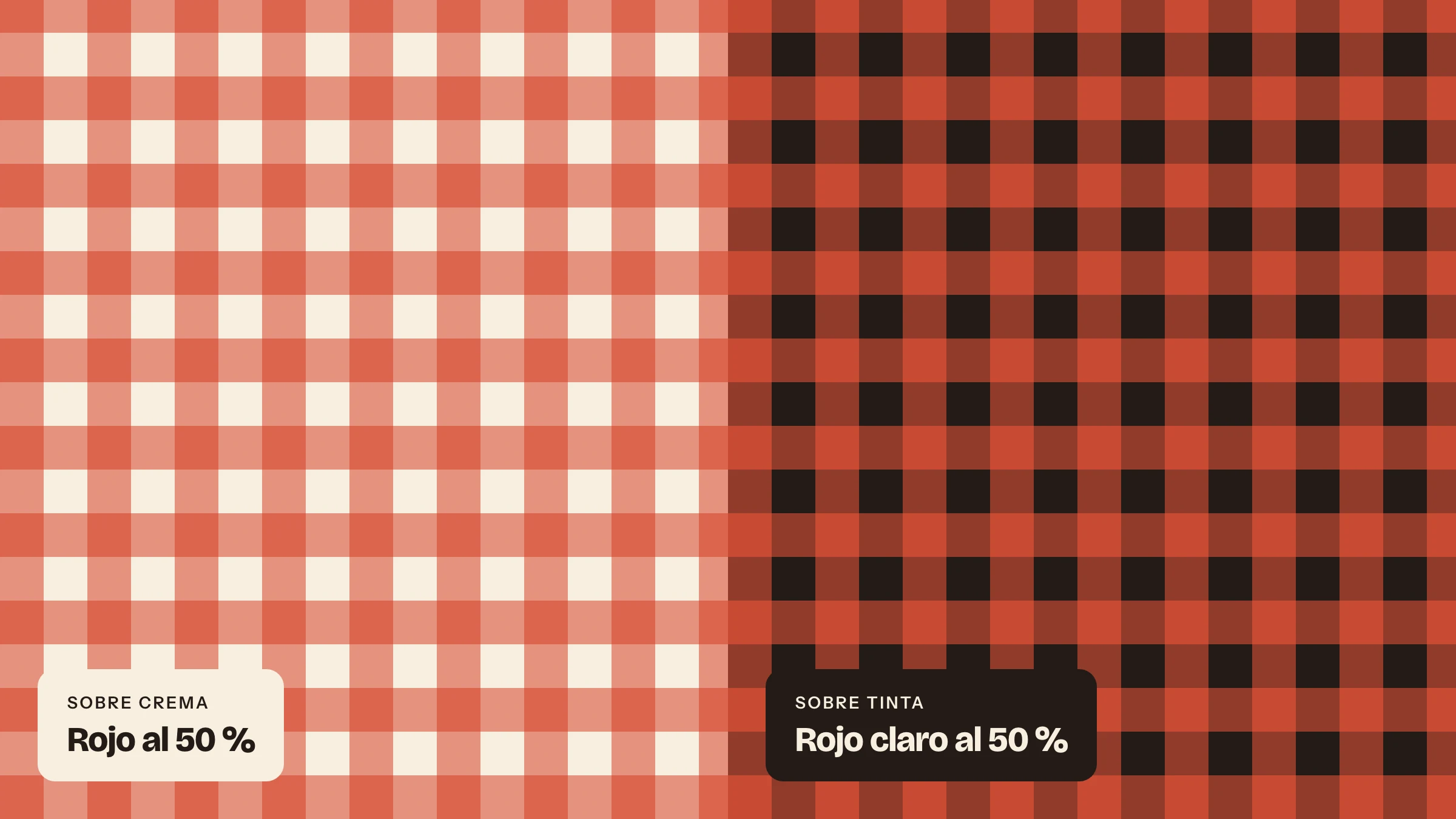
The same weave at a larger scale warms up covers, frames and borders. It is always a background: logo and copy sit on a cream or ink label.
06
Motion
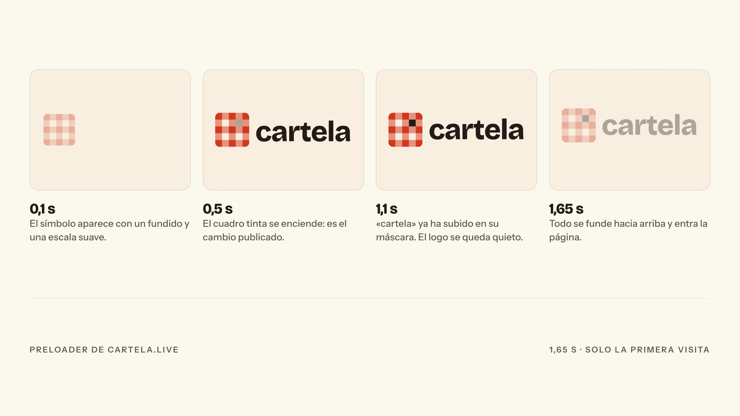
One gesture of its own: a square lights up when something is published. The site opens with the logo building itself, and when a price changes the dark square blinks.
07
In use
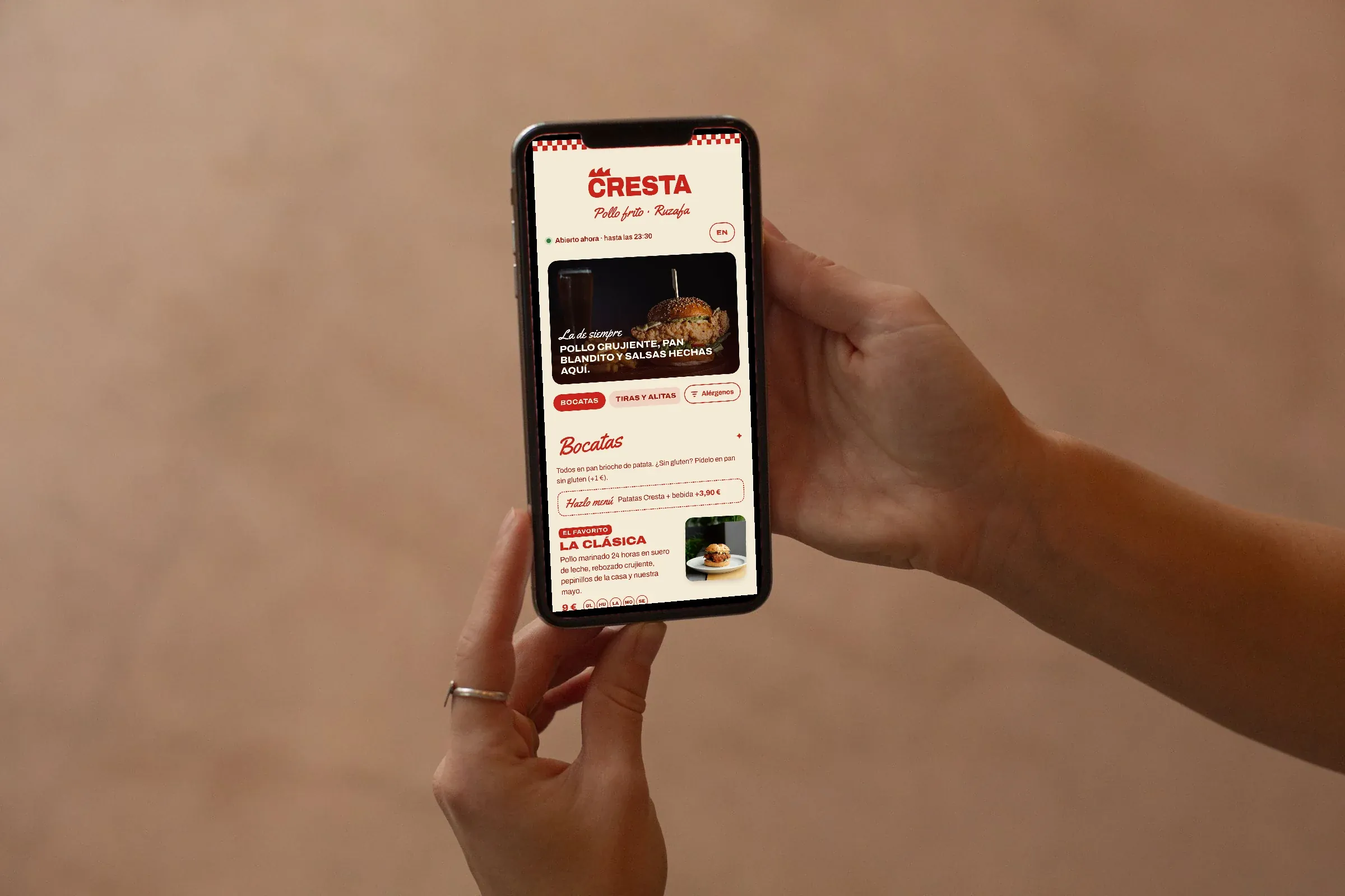
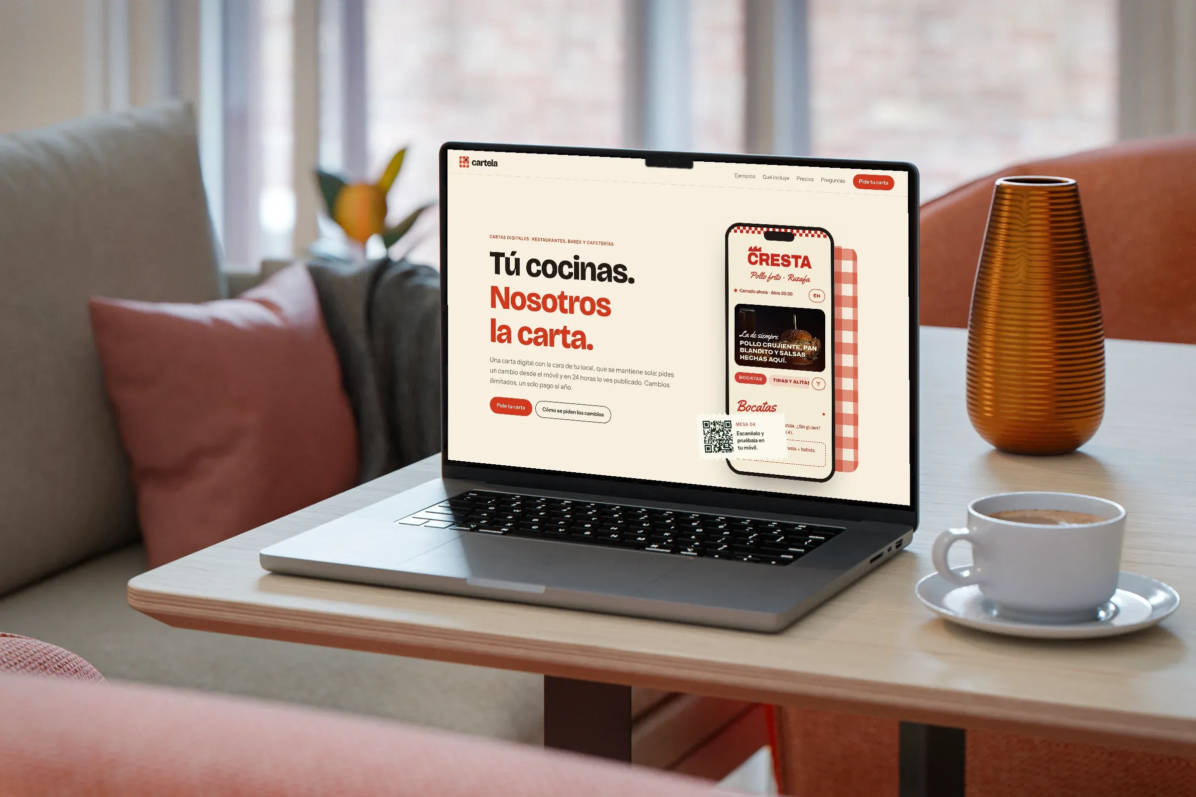
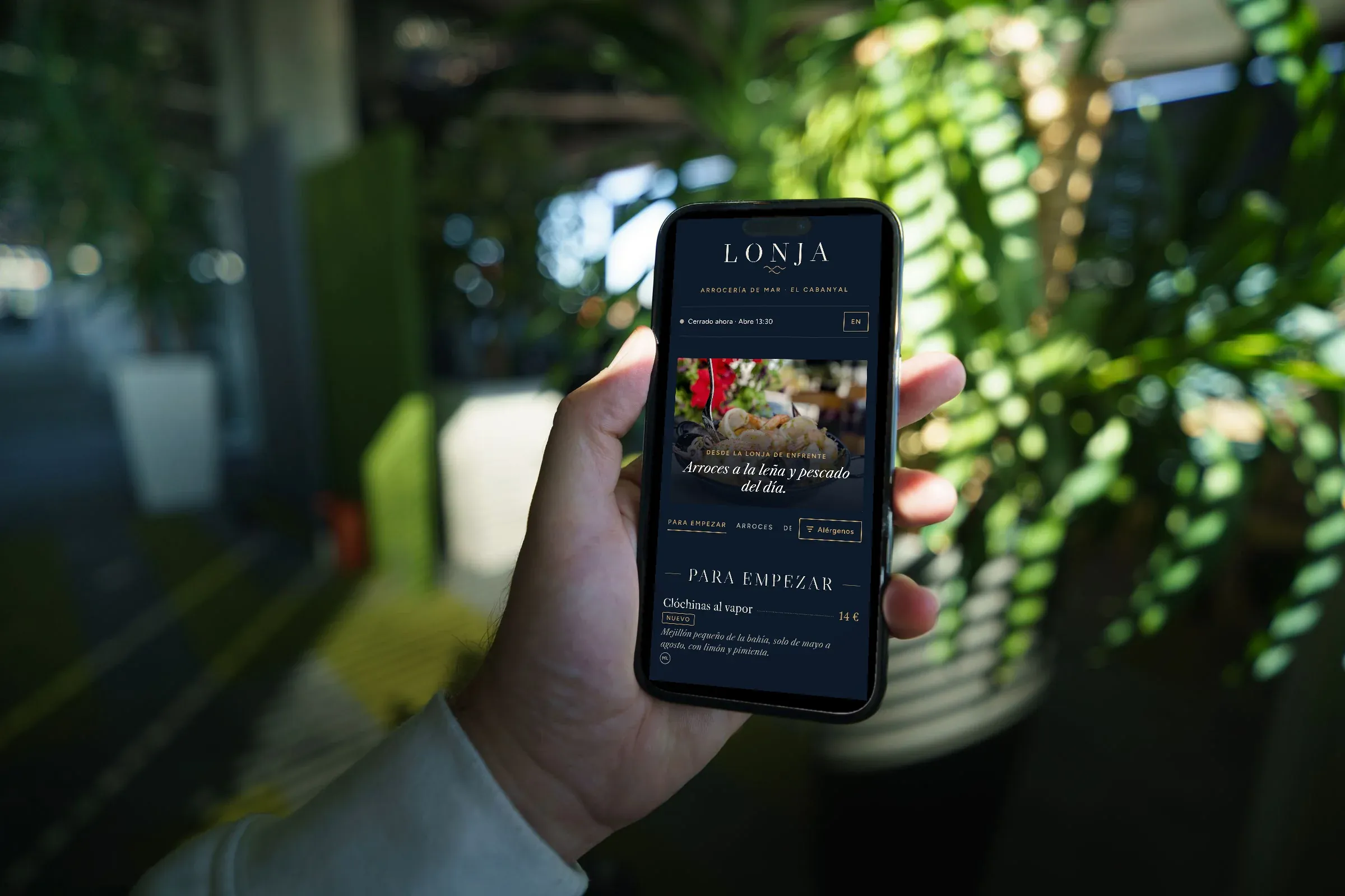
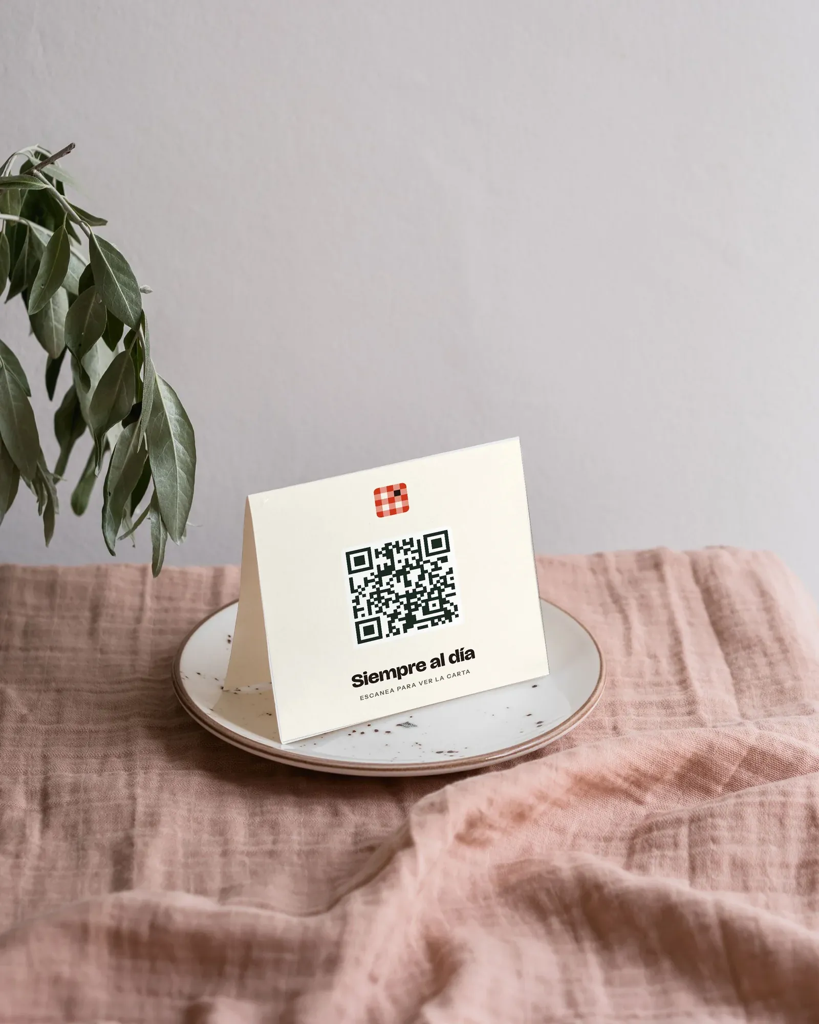
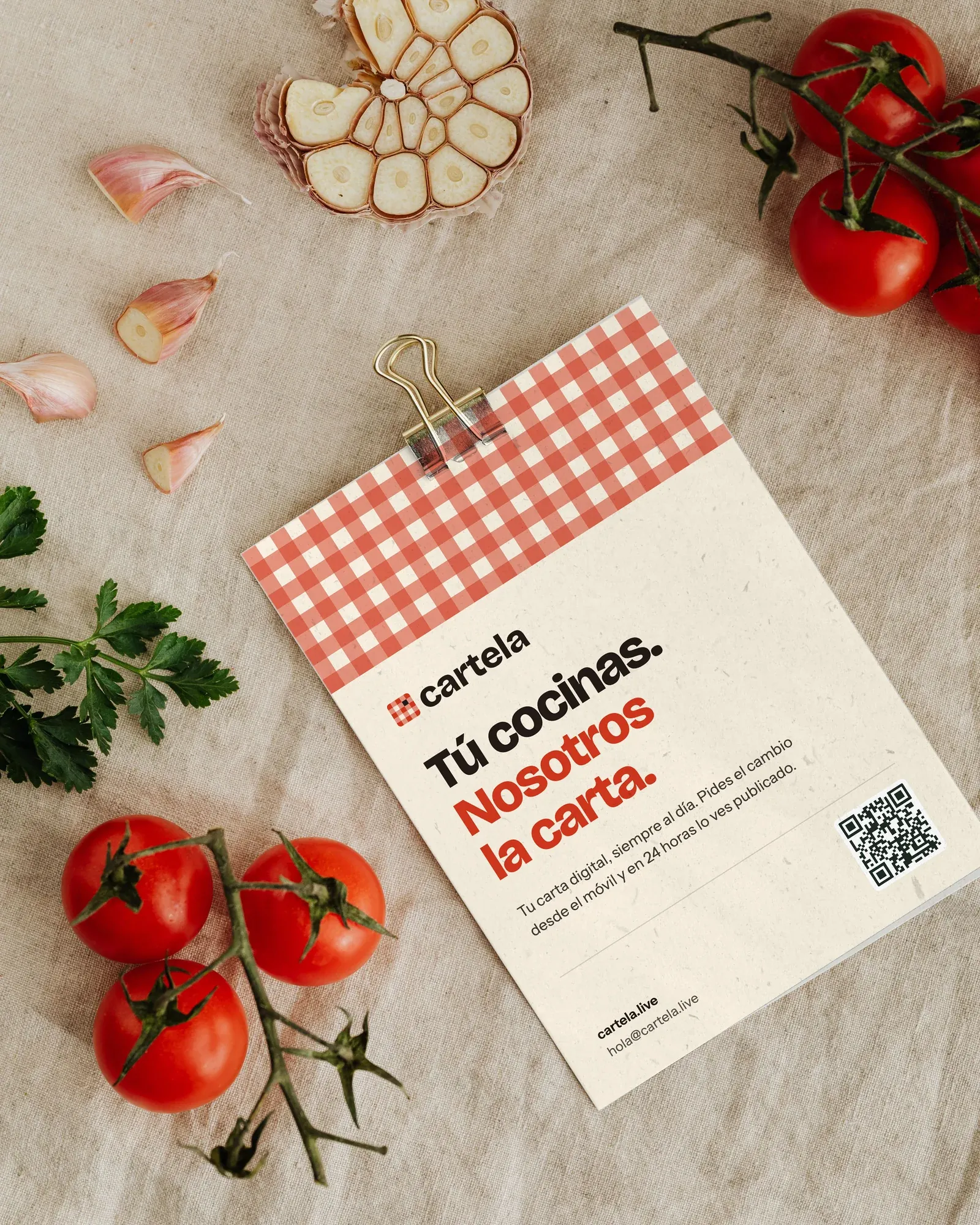
On the table, in the hand and on the wall: business cards, two menus on the phone, the website, a table card with the QR code and a flyer for restaurants. The menus on the phones are concepts for made-up places.