Brand identity2026
Arkevo Studio
A wordmark measured like a building, for a web studio that only works for architecture.
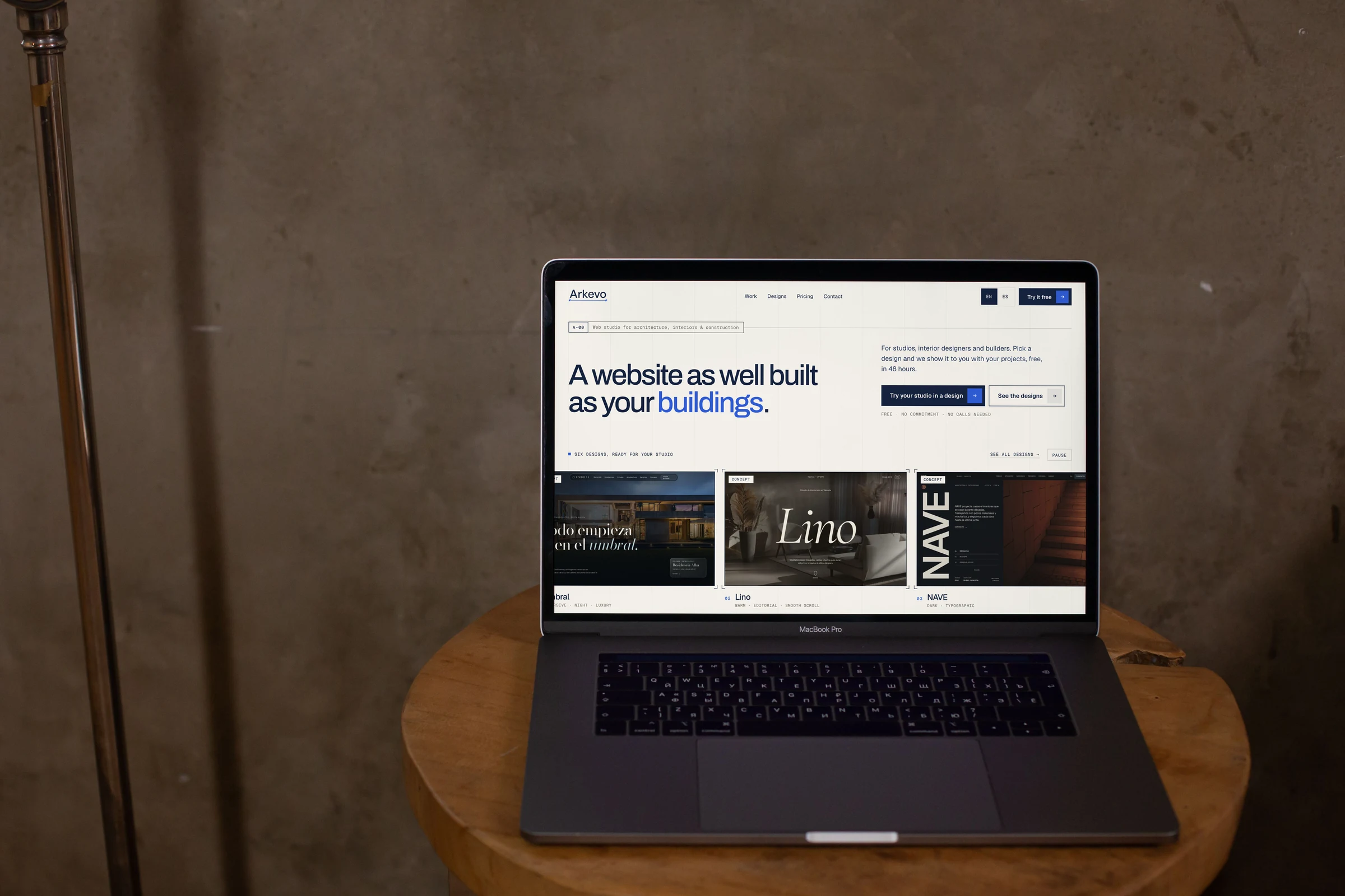
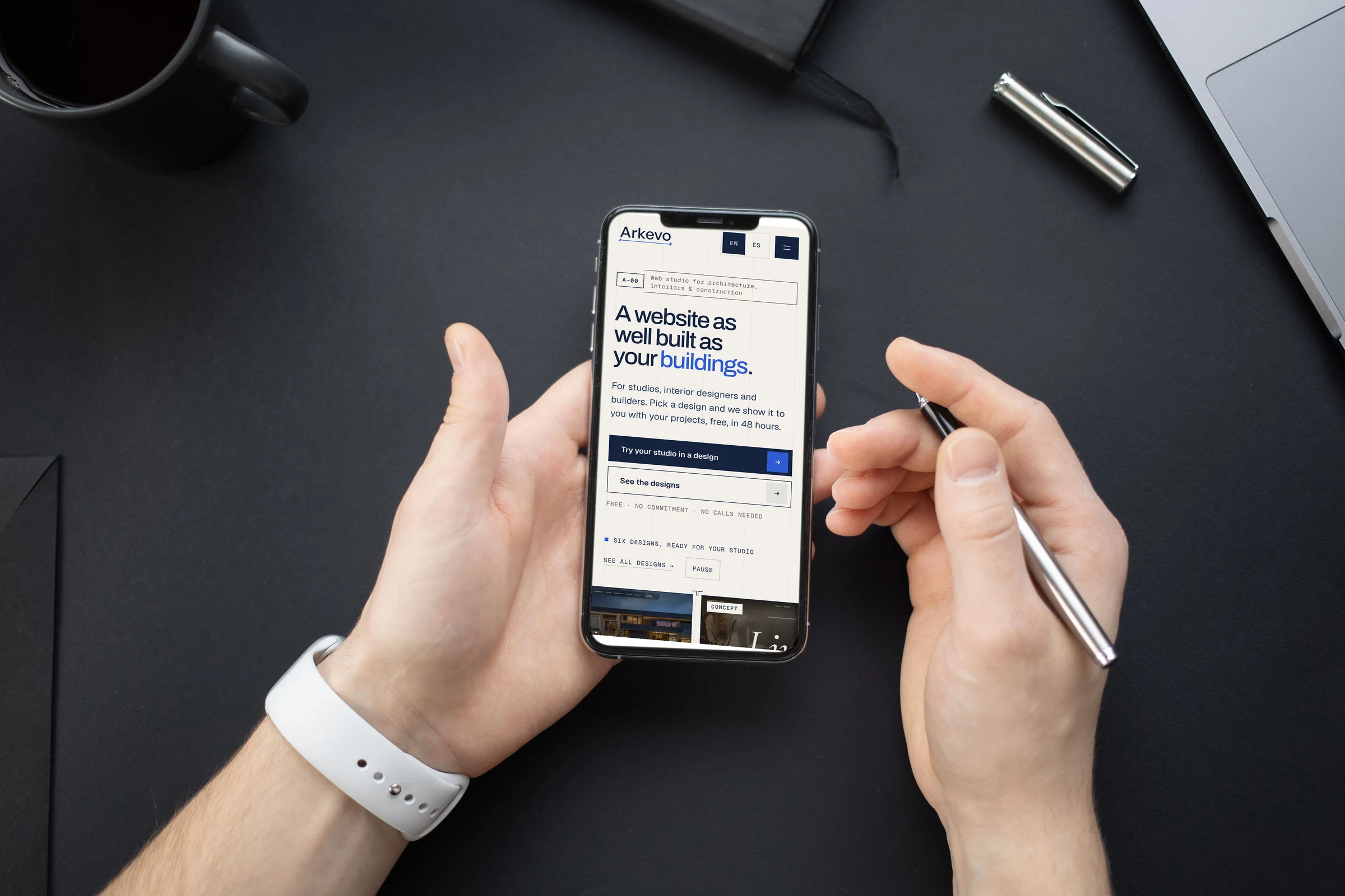
Arkevo Studio is my web studio for architects, interior designers and builders. I named it, designed its identity and built the site at arkevostudio.com.
01
The idea
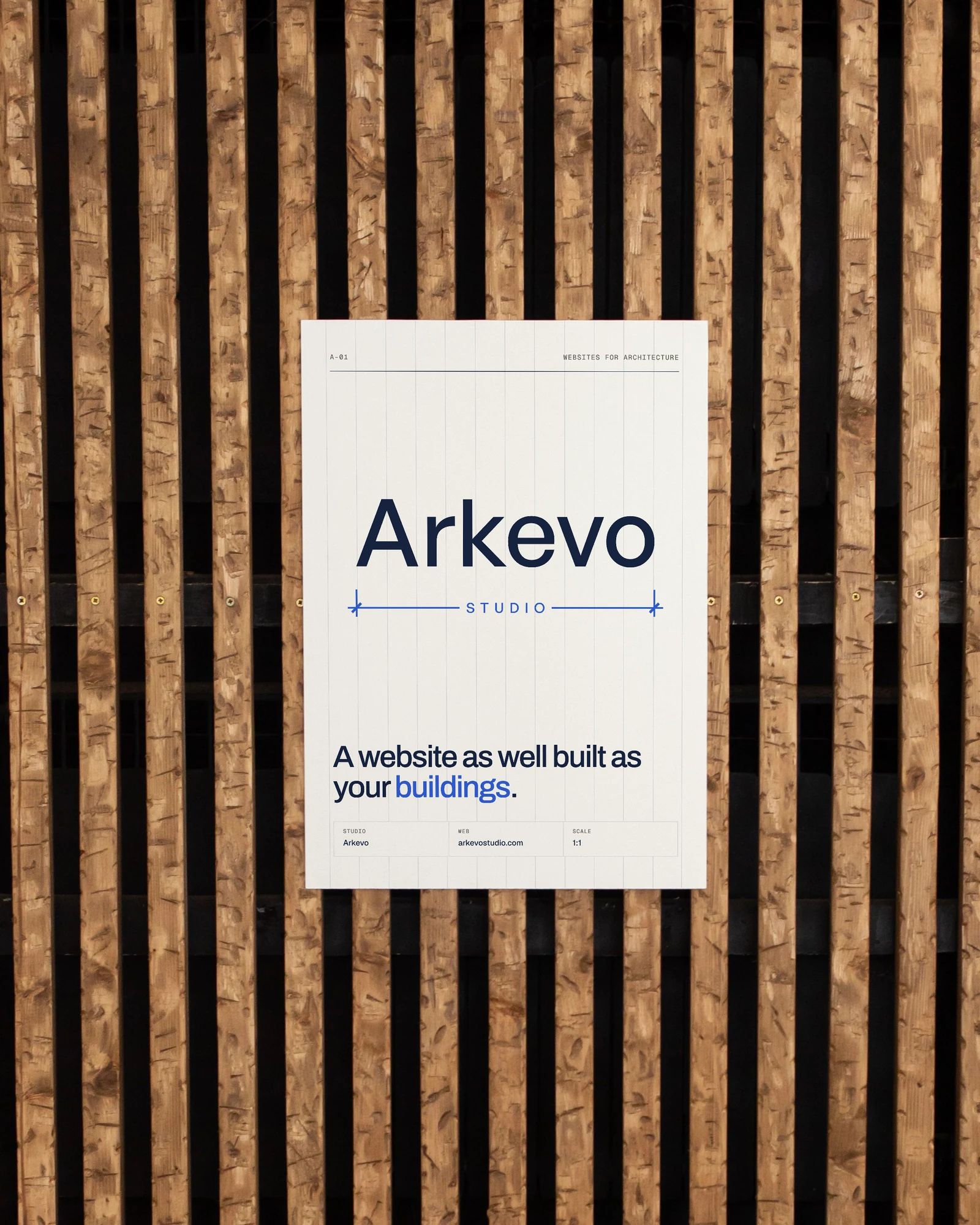
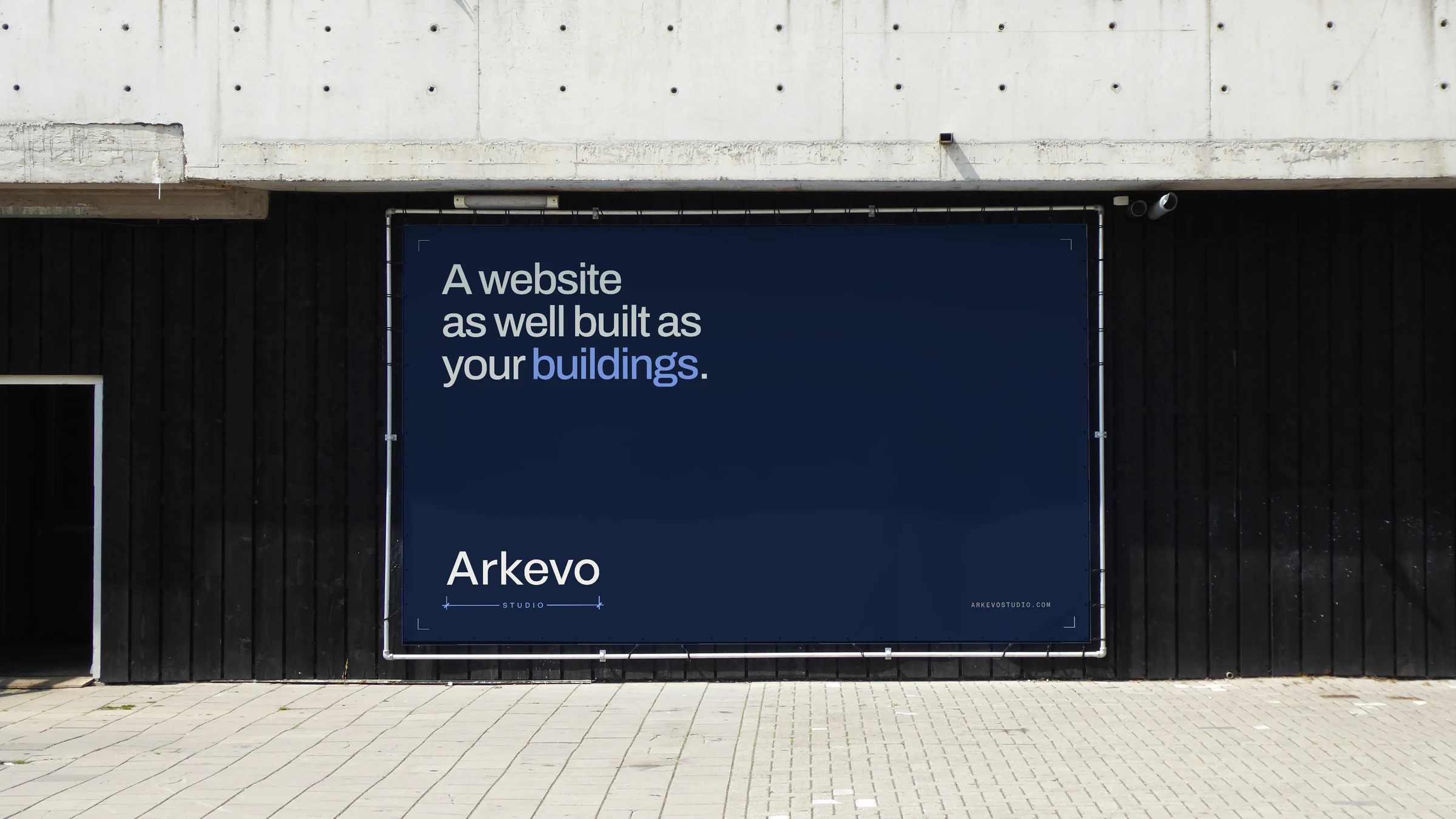
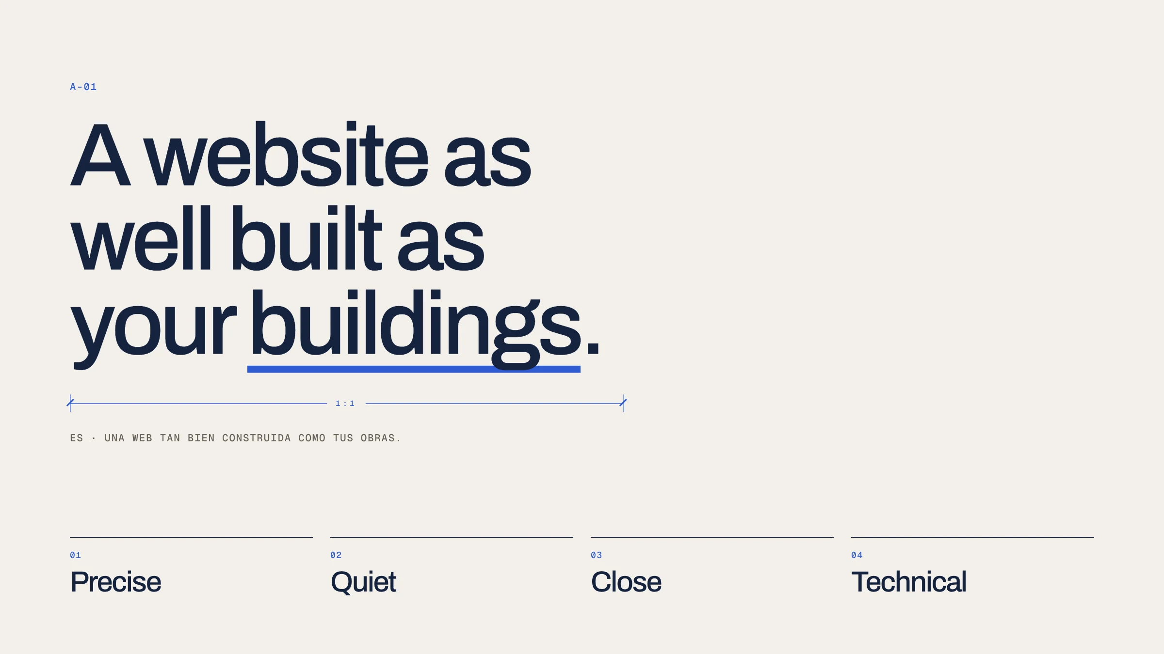
Architects draw with enormous precision, yet their websites rarely look like it. Arkevo speaks their language: plans, sheets and dimensions. The promise is a website as well built as your buildings, and the personality is precise, quiet, close and technical.
02
Logo
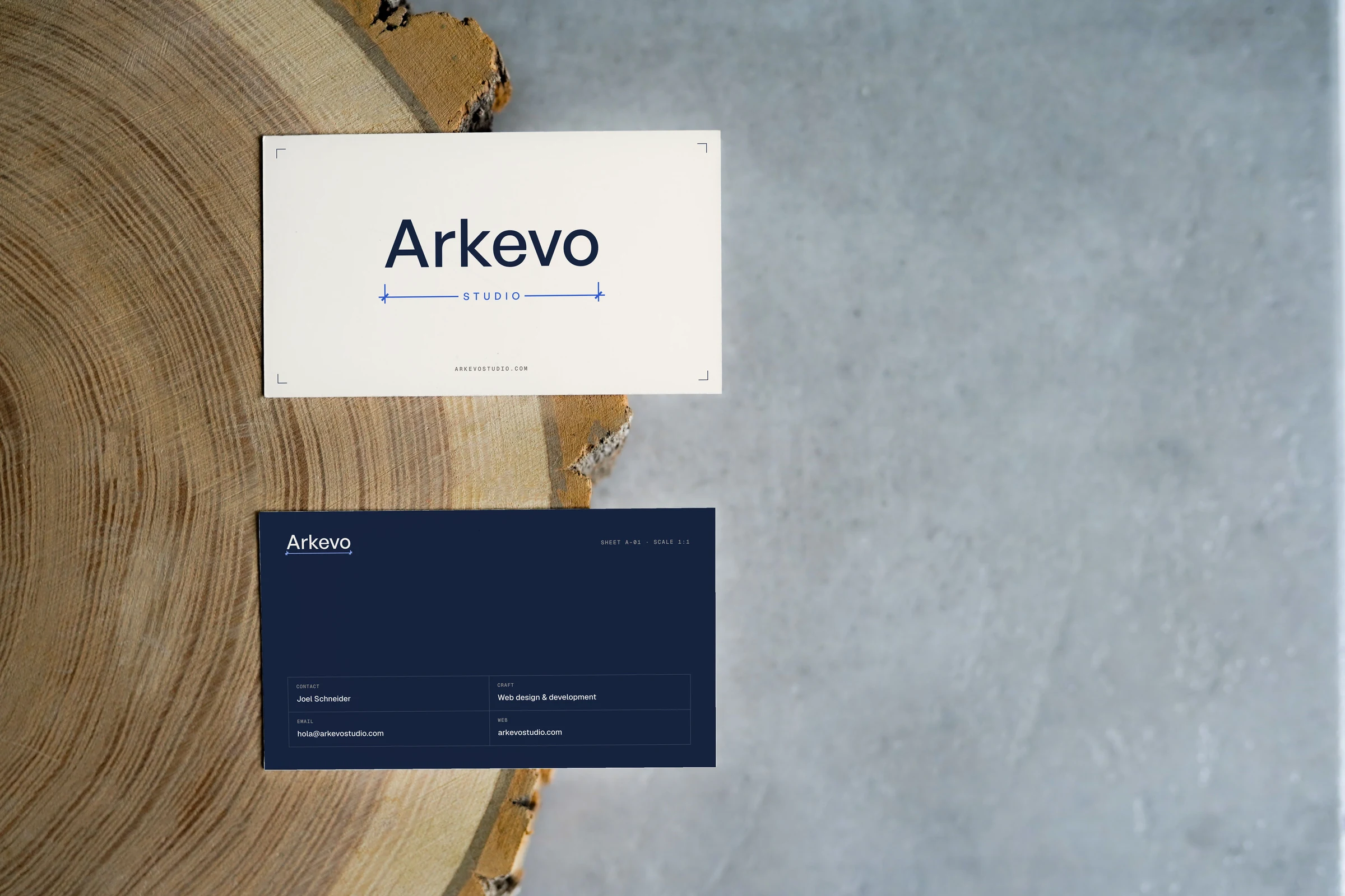
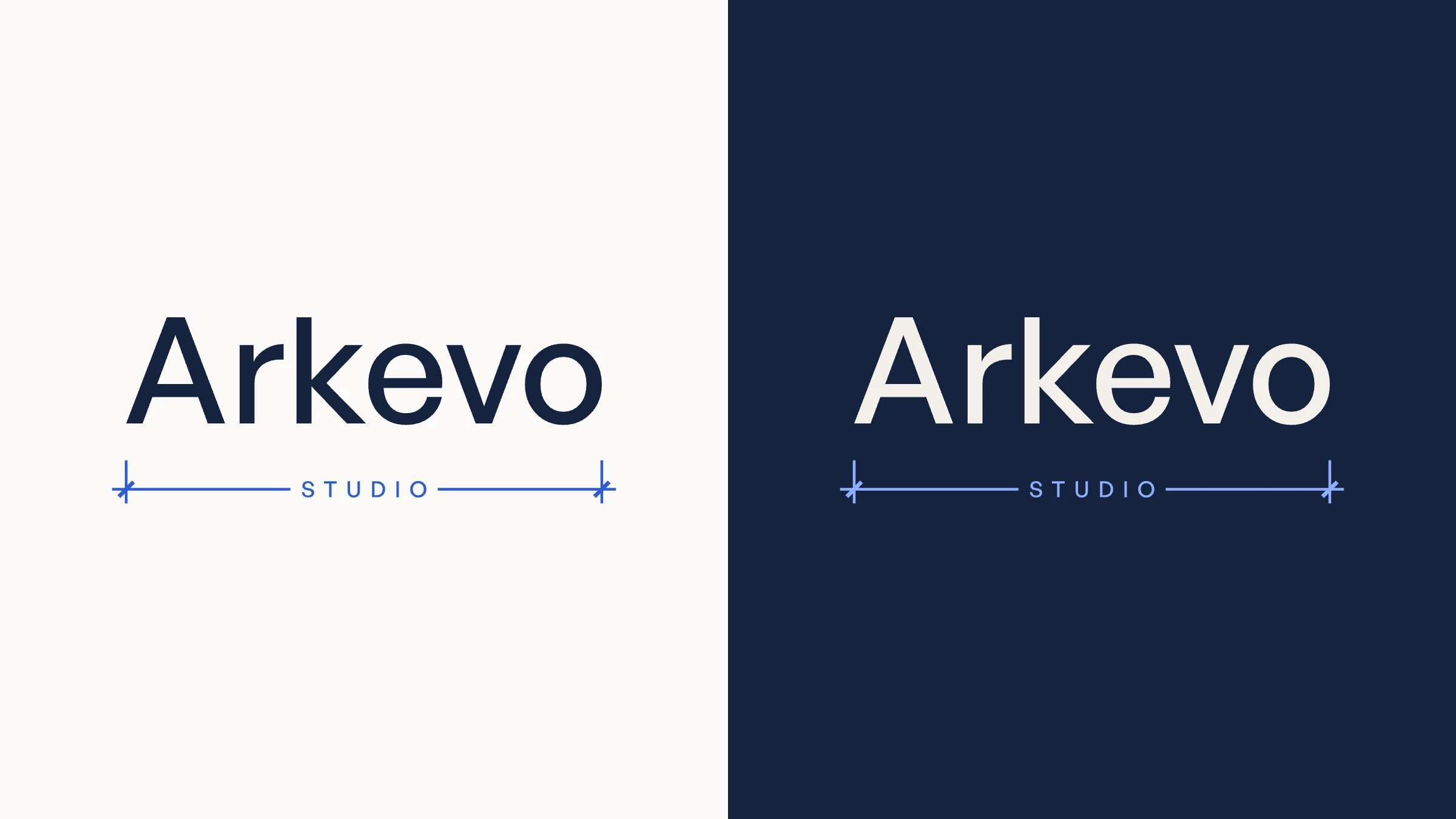
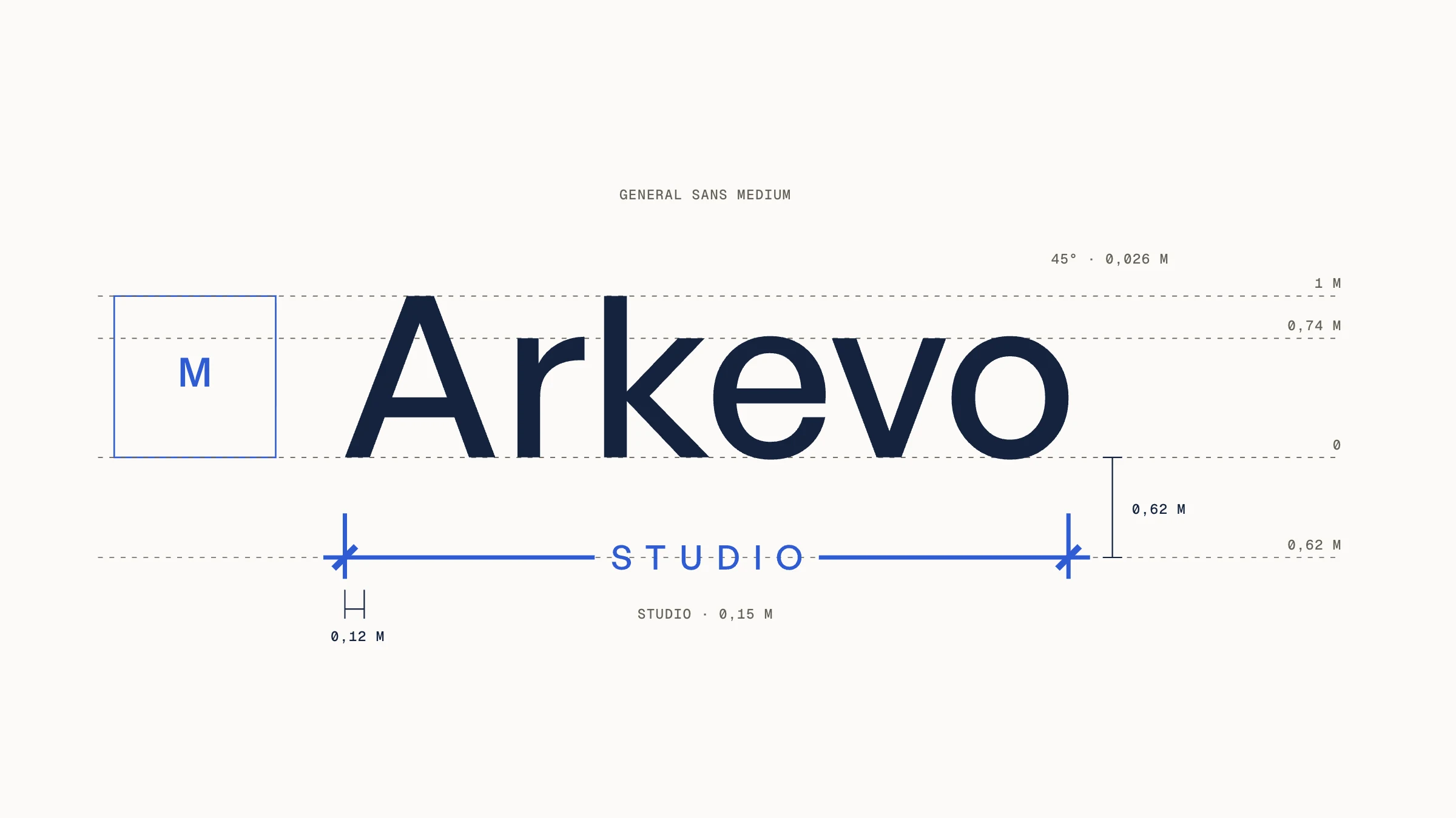
Arkevo in lowercase General Sans Medium, with a dimension line underneath that measures the word end to end. STUDIO interrupts the line like the value of a real dimension. Everything is built on one module, the cap height, and the cota always goes with the word.
03
Colour
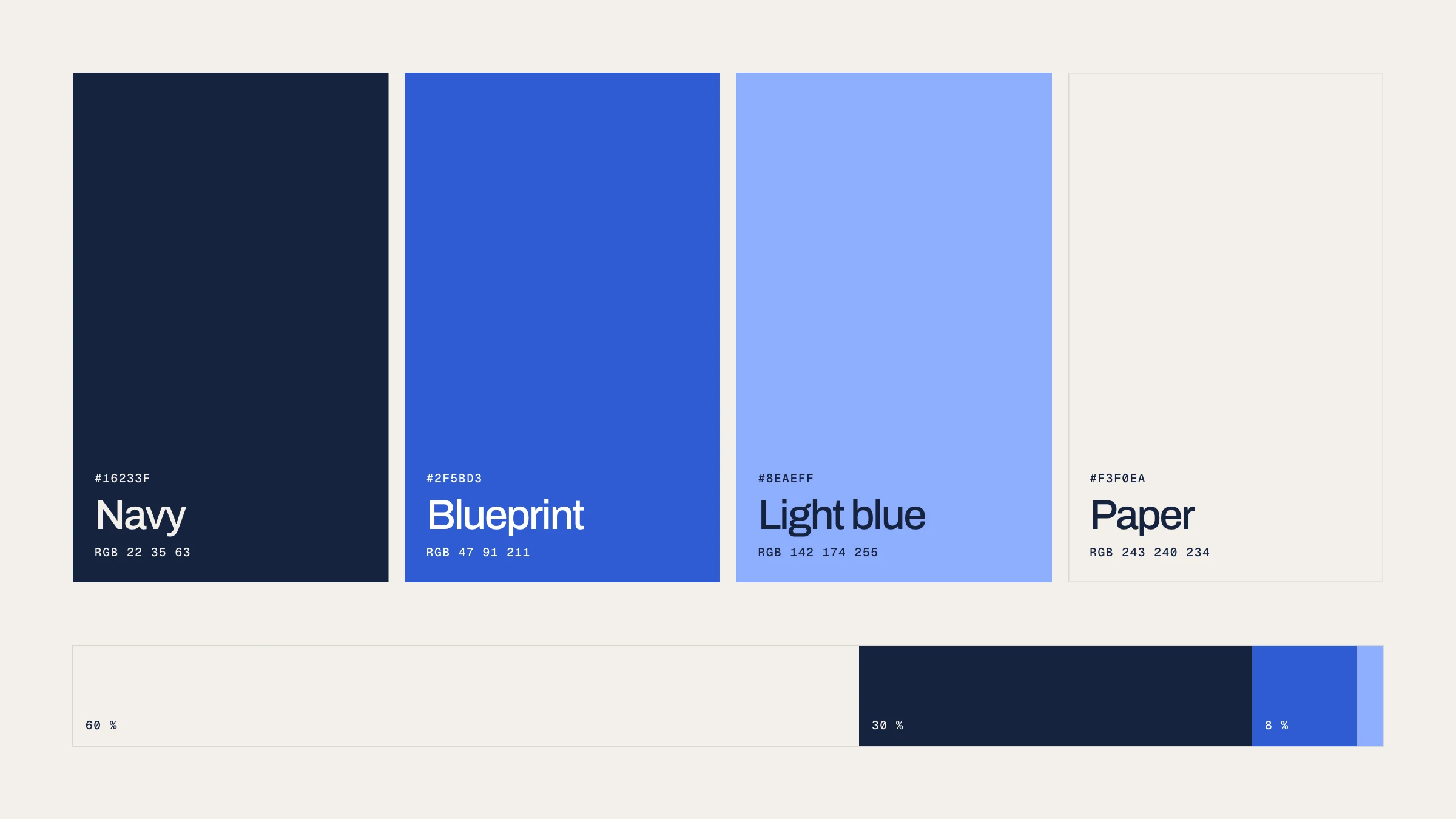
Cyanotype, the blue of old blueprint copies on paper. A navy ink for text, a blueprint blue only where something is measured or clicked, a light blue for accents on dark and a warm paper for everything else. Every pair is measured against WCAG.
04
Typography
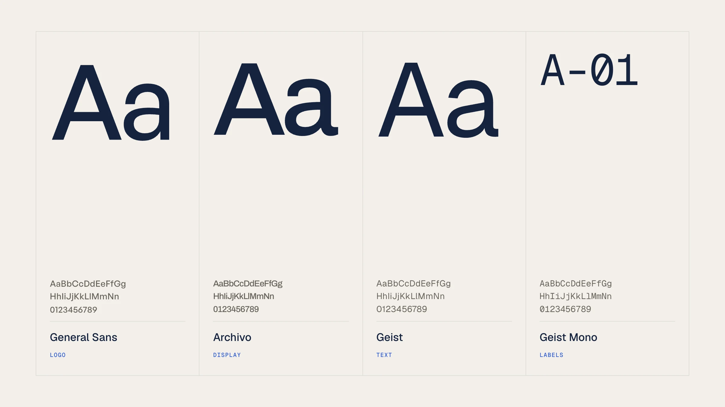
Four families, each with one job. General Sans only in the logo, Archivo for headlines and Geist for text and figures. Geist Mono carries the labels a drawing would have: sheet, scale, date.
05
Graphic language
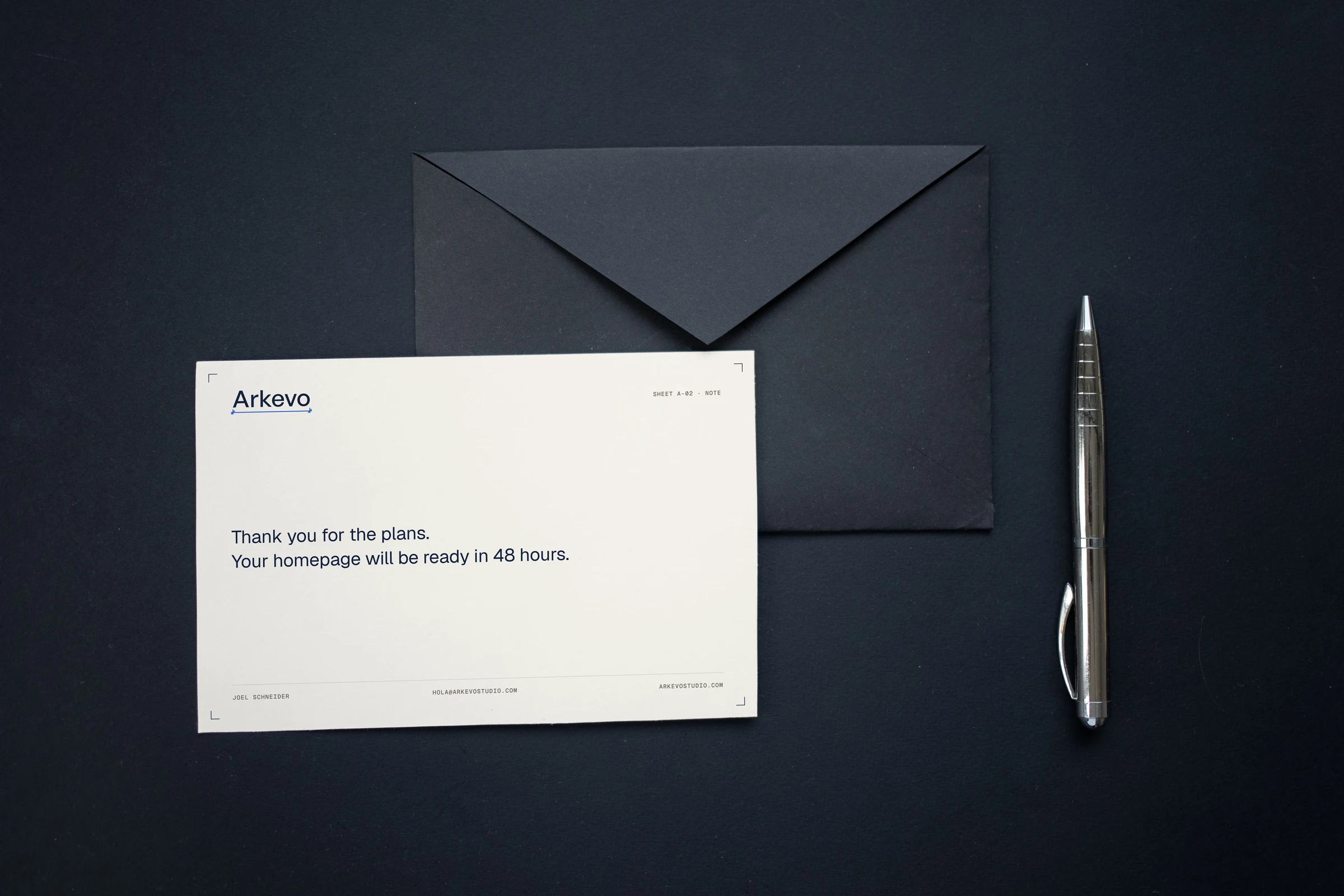
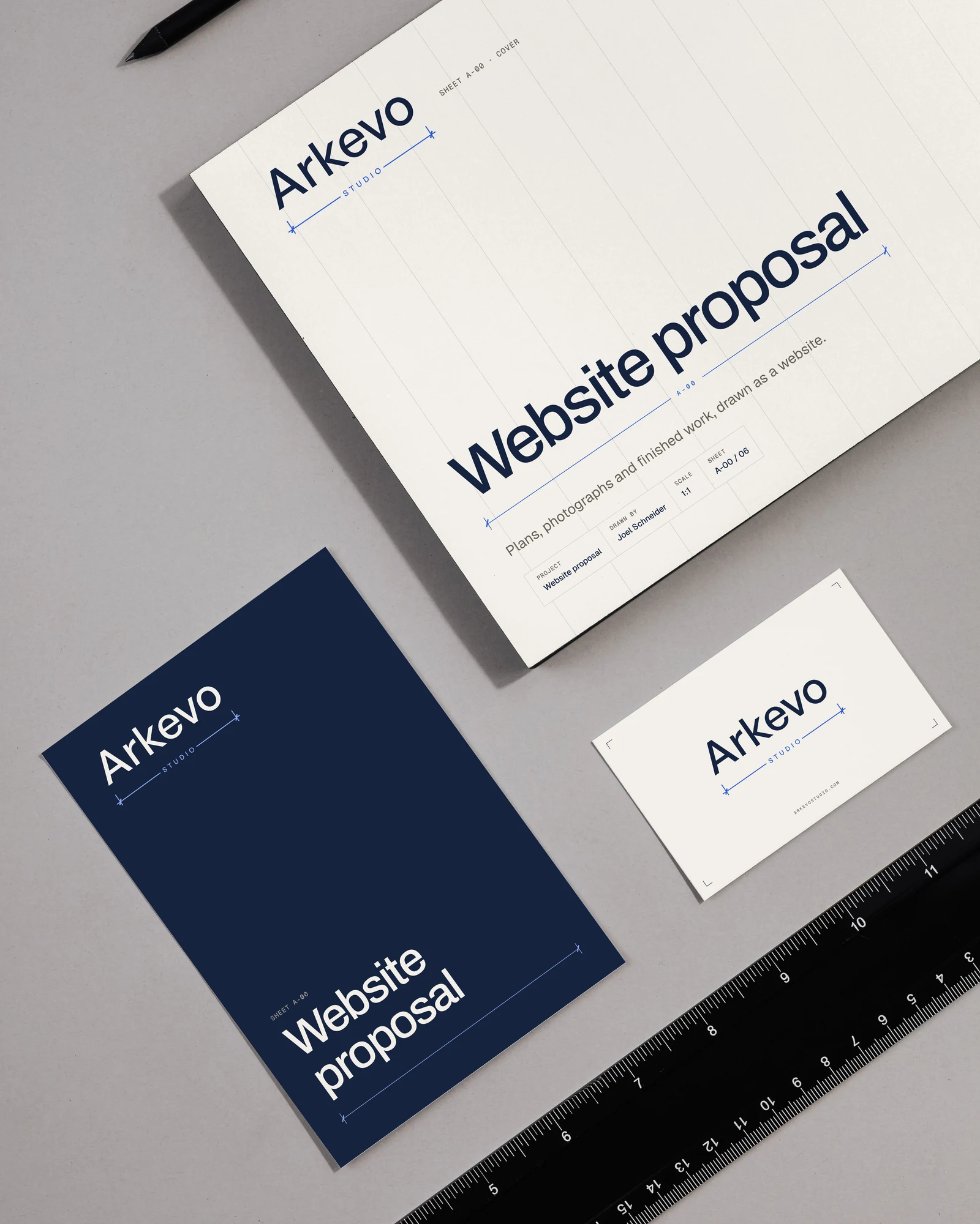
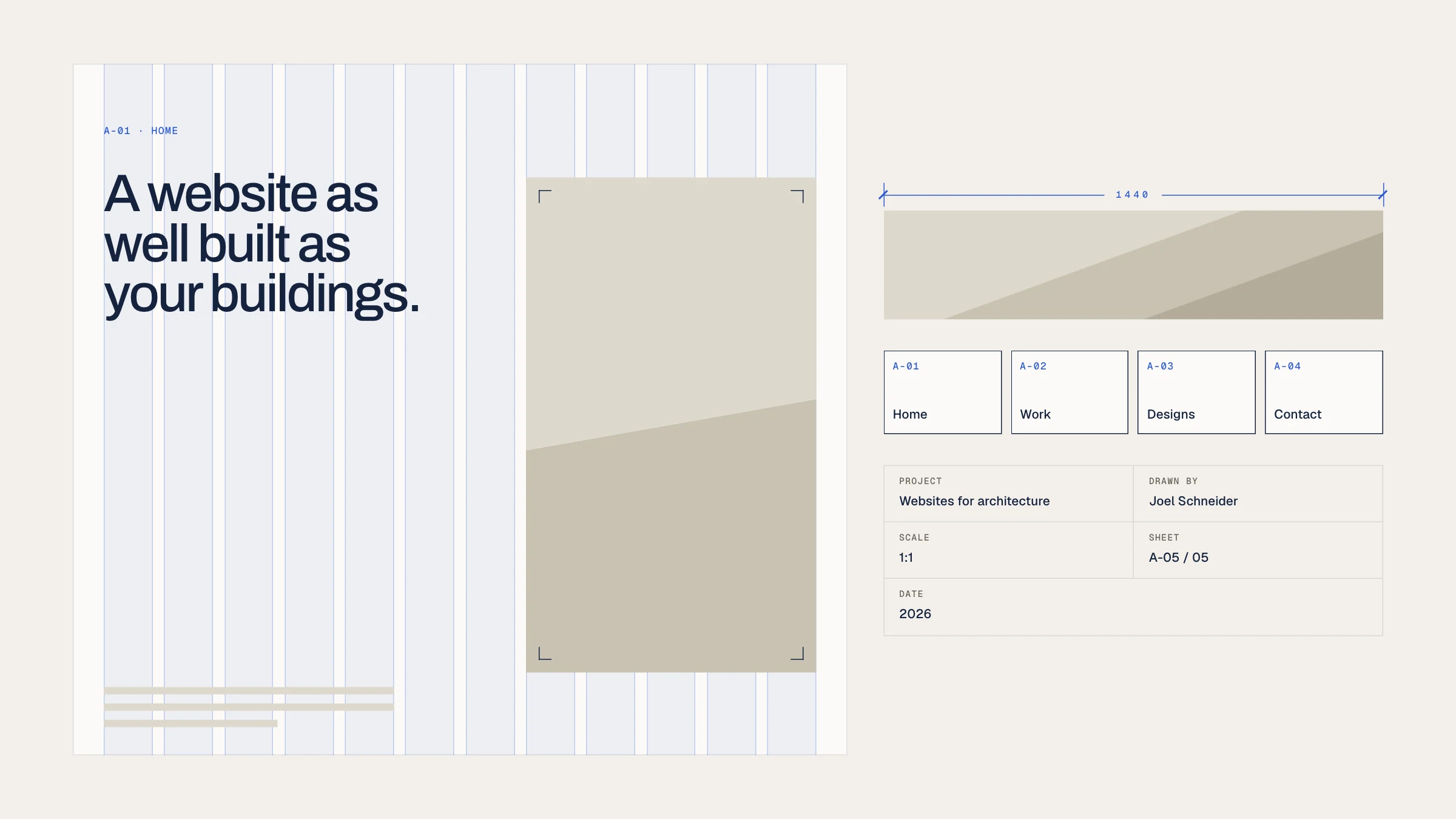
The logo's dimension line becomes a system. Every page is a numbered sheet and headlines and images are dimensioned. Screenshots get corner marks instead of shadows, and a title block closes the website, the card and the documents.
06
Motion
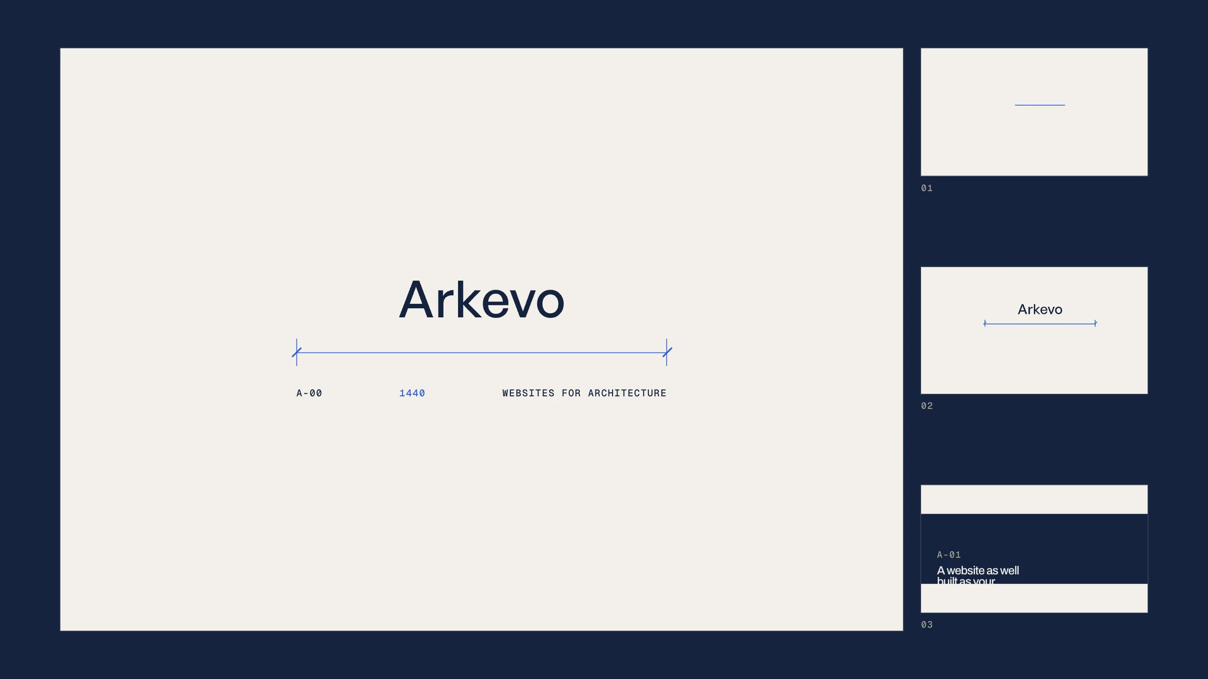
It moves the way it is drawn. On the first visit a dimension line draws itself, counts to 1440, the word arrives and the sheet opens along the line. With reduced motion everything stays still.
07
In use
The identity lives mostly on screen, on arkevostudio.com, where every example site is labelled as a concept. Off screen it stays just as quiet: a card with a title block on the back, notes and proposals drawn as sheets, and a poster where the dimension line does the talking.